Design and Layout Center
Modern Newspaper Layout Tips for Schools
Modern design styles are often in a state of flux. The list below are eight of the common design styles that are currently being implemented by the professionals. Using them will give your project a clean, stylish look that is sure to be appealing.
Tip #1 - Minimalist Design
Don’t make your newspaper look crowded or too busy. Use lots of white space where you can. Newspapers have always looked crowded in the past, but modern design tends to use more white space, thus giving more importance to the images and text you do have on a page.
To give you an extreme example, imagine an entire page with only a single word in the middle: "Desire." That forces all the attention on that one word and the possible connotations. That might be extreme, but the concept of using more white space and making your newspaper look less crowded is valid. Put more space between images and text. Space text out more, and put more white space between paragraphs, columns, and other text boxes. White space is common in the minimalist design world. It's goal is to draw attention to specific parts of your design, rather than trying to fill it up.
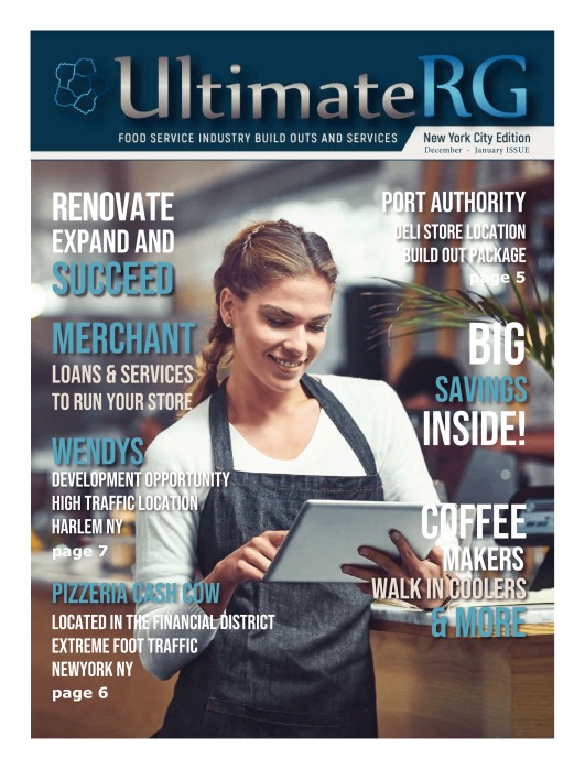
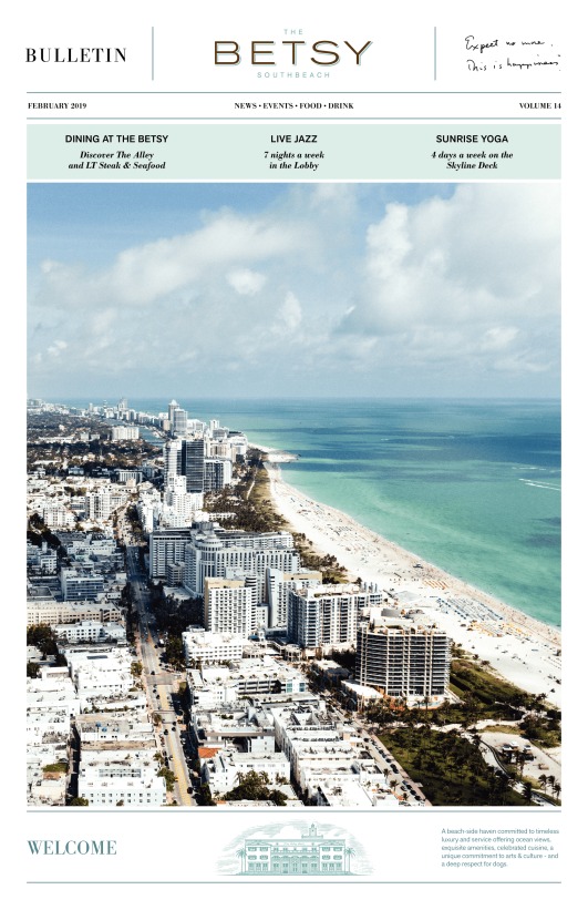
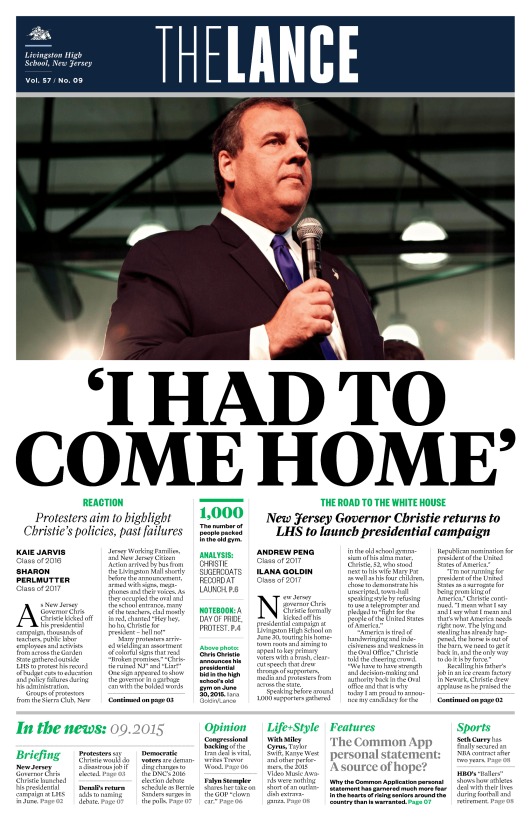
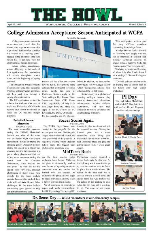
Notice how the following newspapers uses a lot of white space throughout the design.
Tip #2 - Have Good Color Schemes
Don't use too many colors. That just looks messy. Know what colors go well together and which ones clash. On a newspaper, colors will always print darker than what is on your computer screen, so it is important to lighten up your colors. Click Here to learn which colors go well together.
Colors are important, but clashing colors just because they happen to be your favorite ones will not be looked upon well. Colors should be designed to point the reader in the right direction, not distract him or draw the eye away from your main message.
Look through the following real newspapers to see what we mean:
Tip #3 - Flat Look
Try not to use 3D effects, bevels, or too many shadows. Those styles went out last decade when they were novelties at the time. It is the flat appearance that looks clean and stylish. Clean is the operative word. Design now-a-days reflects a clean look instead of a busy, loud, in-your-face look. This concept works well for newspapers. You don't need a lot of effects. You aren't showing off effects. You want people to read your newspaper. Clean is better.
Look through the following real newspapers to see what we mean:
Tip #4 - Grid or Geometric Patterns
Modern design often employs images in a grid or geometric pattern. Again, this gives your project a fresh, clean look with straight lines and easy on the eyes visuals. A newspaper is often laid out in columns. Each column should be the same proportions--particularly in width. Try to keep your columns the same width and aligned with each other up and down. Leave more space between columns than not. There is a tendency to want to cram the columns together to get more information on the page, but that create a very busy and loud design.
Look through the following real newspapers to see what we mean:
Tip #5 - Choose Easy-on-the-Eyes Fonts
Your articles and stories are central to your newspaper design and layout. Don't use fonts that are difficult to read or make out. Use fonts that the eye can pick up on easily and avoid using many different kinds of fonts. Stick with the same font for each of your different text groupings: your main text, your titles, your subtitles, and your headings.
Traditionally, serif fonts have been used for newspapers. Modern newspaper design, however, has begun using san-serif fonts for titles, headings, and article titles and serif fonts for the main, smaller text or copy. Be careful about using decorative fonts. They look cool, but they can be hard to read. The last thing a newspaper wants is for someone to not read it because it is difficult to do so.
Tip #6 - Stay Consistent in Your Font Sizes
Different sized fonts can be used, but stay consistent. When your copy text suddenly gets larger in the column next door, it has an unconscious impact on your readers. Not only does it look messy, but it creates a visual detraction from the message. Typically, an 11 pt or 12 pt font is used for copy. Your main newspaper title can be as big as you like, and article titles range between 14 and 18pt font sizes. What ever you choose, remain consistent.
Tip #7 - Alignment Is Essential!
It may seem tedious, but a well-aligned newspaper will standout as being far superior to those that are not aligned properly. Here are some areas of alignment you should consider:
- Columns - Make sure your columns are the same width and either aligned at the top or the bottom and evenly spaced between themselves.
- Pictures - Align pictures to each other where you can and to text where appropriate. Always try to show straight lines.
- Titles - Align titles vertically or horizontally where obvious. Centering titles over columns will also look good.
- Horizontal and Vertical Spacing - If you have space on the right, make sure there is the exact same amount of space on the left. If you have space between a title and a textbox, make sure that you keep the same spacing between other titles and textboxes.
- Keep picture aspect ratios - If you need to shrink a picture on only one side only (vertically or horizontally) to make it fit a particular space, don't shrink it. This will only make your picture look fat or skinny instead of natural. Instead, crop it. It is always better to crop the picture to align it than to make an image look unnatural.
Look through the following real newspapers to see what we mean:
Tip #8 - Manage Free Space
Empty space is as important as the space you do use. Leaving large holes in your newspaper design is not wise, but trying to use all the free space up may not be wise either. Well positioned empty or white space can make a newspaper really stand out, look clean, look fresh, and look elegant.
Free Cloud Designer Templates
Our templates are 100% customizable, super user-friendly, and designed specifically to help you create outstanding school newspapers with our free Cloud Designer. Below are a few of the 100s of templates available to you. The first three show the various sizes we offer.